Form Editors
The following form editors are configured via attributes set on the fields in a Form.cs file.
Text
String Editor
This allows plain text to be entered.
Options
This editor has no configurable options.
Text Area Editor
This text area editor is mainly used in entering descriptions or multi-line text.
Options
| Option | Type | Description |
|---|---|---|
| Cols | int | |
| Rows | int | Sets the height in rows of the Text Area. |
Set a Text Area to 4 Lines in height
This change is made in the Form.cs file.
[BasedOnRow(typeof(Entities.ExampleRow))]
public class ExampleForm
{
    [TextAreaEditor(Rows = 4)]
    public String ExampleText { get; set; }
}
Email Editor

The email editor consists of two texts boxes divided by an at (@) symbol. The second box is the domain part of the email address.
Options
| Option | Type | Description |
|---|---|---|
| Domain | string | Sets the default value of the domain portion of the email address (second box). |
| ReadOnlyDomain | bool | Makes the domain portion of the email read only. |
Make an email editor accept only a particular email domain

[FormScript("ExampleForm")]
[BasedOnRow(typeof(Entities.ExampleRow))]
public class ExampleForm
{
    [EmailEditor(Domain = "lockeddomain.com", ReadOnlyDomain = true)]
    public String Email { get; set; }
}
Password Editor
The password editor allows for text to be entered but masked in the form.

WARNING: Any Password Editor fields still send their data in plain text format.
Options
This editor has no configurable options.
Masked Editor
The masked editor can restrict the input to a specific set of letters or numbers. Serenity uses the Masked Input Plugin.
Options
| Option | Type | Description |
|---|---|---|
| mask | String | Input mask. Refer to the Input Mask Grid below for supported syntax. |
| placeholder | String | The placeholder character or placeholder text to display. |
Input Mask Syntax
| Mask | Type | Info |
|---|---|---|
| a | Alpha Character | Allow Alpha Character Only. |
| 9 | Numeric Character | Allow Numeric Character Only. |
| * | Alphanumeric Character | Allow Alphanumeric Character. |
| ? | Optional Input | Any values after this mask are considered optional. |
URL Editor
The URL editor is a simple text input that validates and checks if a URL entered is valid syntax. The input will also prefix http:// to the text if it is omitted.
Options
This editor has no configurable options.
Numerical
Numerical fields restrict the input mainly to numerals. In the case of the Decimal Editor, the decimal point is also present.
Integer Editor
The integer editor only allows for numerals to be entered into a input box.
Options
| Option | Type | Description |
|---|---|---|
| MinValue | long | Minimum Value that can be entered. |
| MaxValue | long | Maximum Value that can be entered. |
Decimal Editor
The Decimal Editor allows for a fractional value to be entered into a form.
Minimum and Maximum values
By default the Decimal Editor does not allow negative values. To allow this the MinValue and MaxValue options must be set.
[DecimalEditor(MinValue = "-999.99", MaxValue = "999.99")]
public Decimal ExampleProperty { get; set; }
When setting the
MinValueandMaxValueoptions, make sure you use the same number of digits in both the minimum and maximum.
Decimal places
The decimal places can be configured by setting the Scale attribute to the amount of places. For example, to set an input of two decimal places:
[DisplayName("Example Property"), Scale(2)]
public Decimal? ExampleProperty
{
    get { return Fields.ExampleProperty[this]; }
    set { Fields.ExampleProperty[this] = value; }
}
In some cases like accounting, you may want to
Scaleto 4 decimal places.
Phone Editor
The Phone Editor is for telephone fields.
Only Turkey telephone numbers are supported.
Options
| Option | Type | Description |
|---|---|---|
| AllowExtension | bool | |
| AllowInternational | bool | |
| Internal | bool | Validates against a valid internal phone number. |
| Mobile | bool | Validates against a valid mobile number. |
| Multiple | bool |
Check/Option
Boolean Editor

The boolean editor is a checkbox field that can be selected.
Options
This editor has no configurable options.
Radio Button Editor
Check List Editor
Special
Check Tree Editor
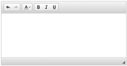
Html Content Editor
This editor is used for WYSIWYG content editing.
Options
| Option | Type | Description |
|---|---|---|
| Cols | ||
| Rows | int | Sets the height in rows of the Content Editor. |
Files and Uploading
File Upload Editor

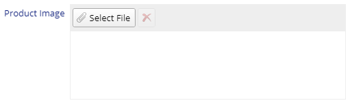
Image Upload Editor
Date and Time
Date Editor

Time Editor
Options
| Option | Type | Description |
|---|---|---|
| IntervalMinutes | int | Sets the minute interval. |
| StartHour | int | The Start Hour to show. |
| EndHour | int | The End Hour to show. |
| NoEmptyOption | bool |
Date Time Editor

The Date and Time editor allows you to select a date and a time from two drop downs.
Options
| Option | Type | Description |
|---|---|---|
| SqlMinMax | bool | |
| IntervalMinutes | int | Sets the minute interval time for the Time drop down. |
| StartHour | int | The Start Hour to show in the Time drop down. |
| EndHour | int | The End Hour to show in the Time drop down. |
| MinValue | DateTime | |
| MaxValue | DateTime |
Date Year Editor

The year editor allows you to select a year from a drop down list.
You must specify the starting (minimum) and ending (maximum) range otherwise the drop down will be empty.
Options
| Option | Type | Description |
|---|---|---|
| MinYear | String | The minimum year to display in the editor. |
| MaxYear | String | The maximum year to display in the editor. |
Drop downs
Enum Editor
Lookup Editor

The lookup editor is a drop down that references data from another table in the database. It has a Filter text at the top and can dynamically load additional data. It is the Select2 drop down for jQuery. Refer to the Lookup Editors section for more information on how to use this Editor.